
Logo Design for SORRYSORRYSORRY
Why the name?
SORRYSORRYSORRY is a brand name that I began using during my undergraduate thesis. My thesis criticized the social conditioning of women and non-cis genders to live apologetically – citing feminist scholars such as Judith Butler, Roxanne Gay, and Lindy West, also contemporary artists like Riikka Hyvonen, Emil Ferris, Anna Biller, and Jenny Saville. My use of the repeated apology is a tongue-in-cheek response to a culture that bolsters self-effacing and empty platitudes.
Additionally, the brand name reflects my exploration of my Jewish heritage. The concept of teshuvah, translated as “repentance,” is not only a form of asking for forgiveness, but considered a personal transformation. In this process, one has three chances to amend their mistake. This practice contrasts with the aforementioned systematic lens of shame, as it forefronts individual accountability rather than a projection of insecurity on a wider demographic.
I’ve maintained this branding in my personal artwork and I strive to extend the theme in my professional design.
-

Primary Logo
This should be used first if space allows for it. Use it on websites, footers, stationery, signage etc.
-

Secondary Logo
For when the primary logo doesn’t fit in the required space. Use for websites & printed materials.
Font / font customization
The font for the SORRYSORRYSORRY logo is Providence Sans Pro customized to substitute the “O” with the shape from the logo’s graphic element. In the logo, the primary shape element has a line weight of 20 pt when illustrated at 15.5 inches. The secondary shape taking the form of the “O” in “SORRY” has a line weight of 25 pt when illustrated at 1.4 inches.
Embracing a playful font style adds a sense of lightheartedness to the brand, creating an unexpected twist given the serious theme. The whimsical typography injects personality and a touch of informality into the overall design.
Approved Logo Variations
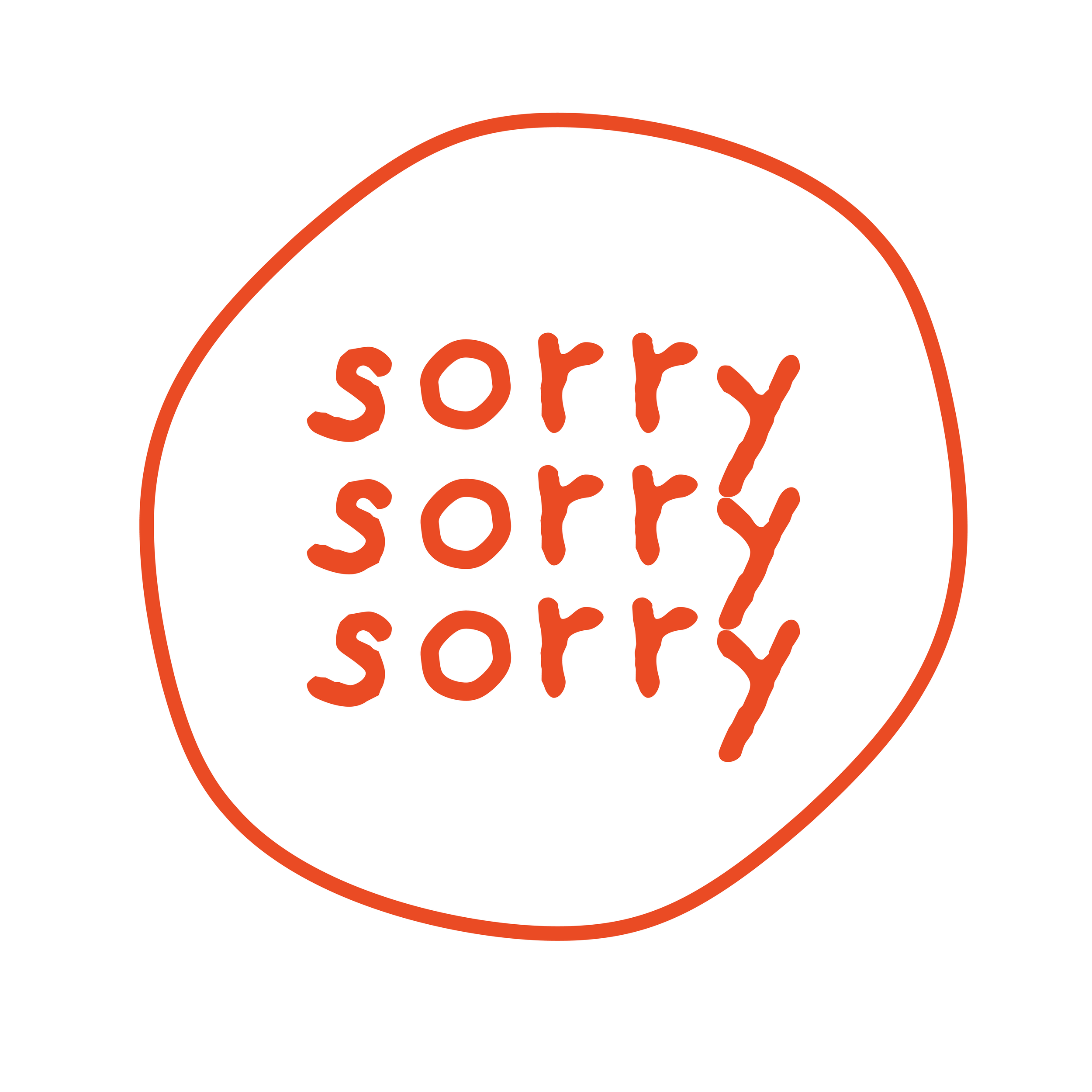
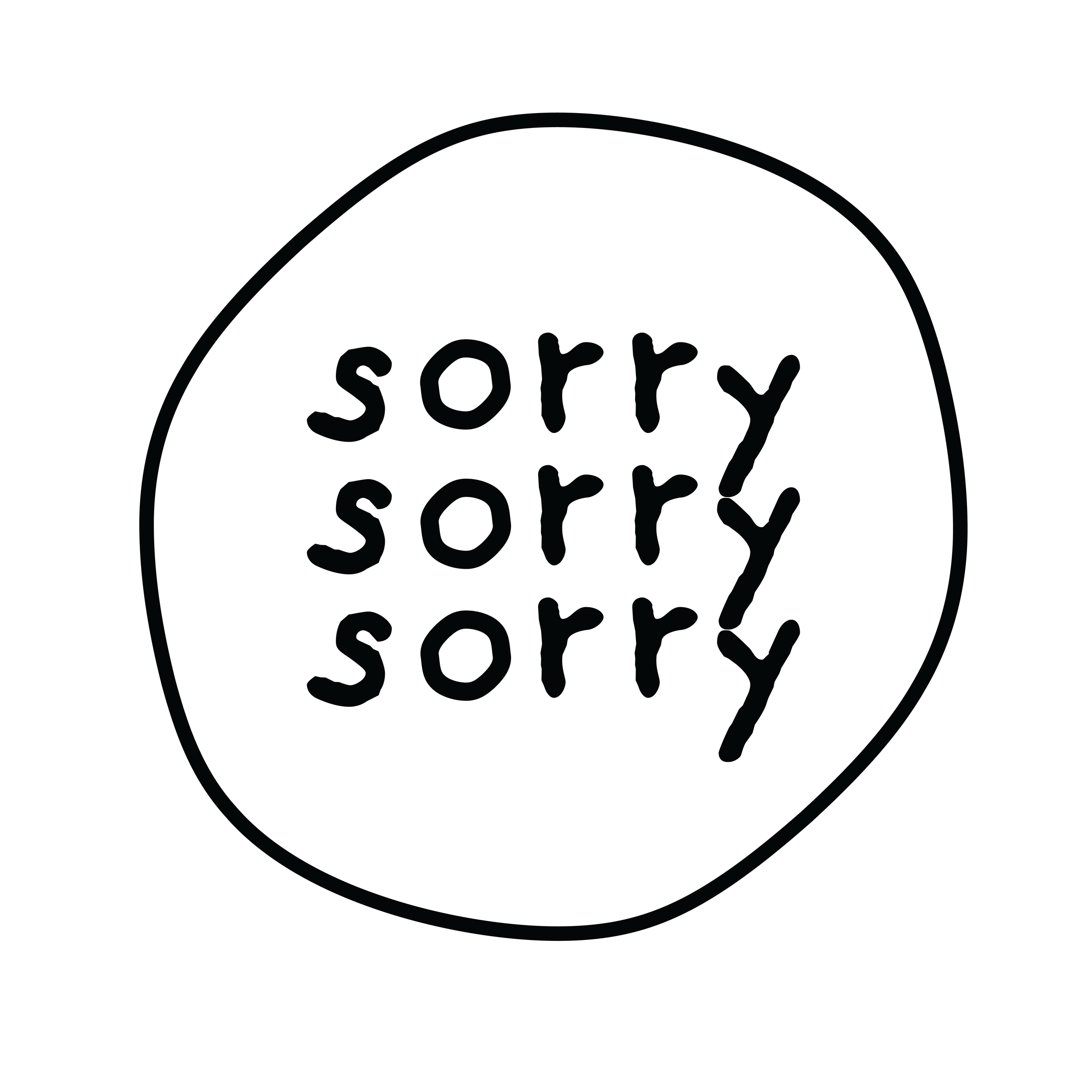
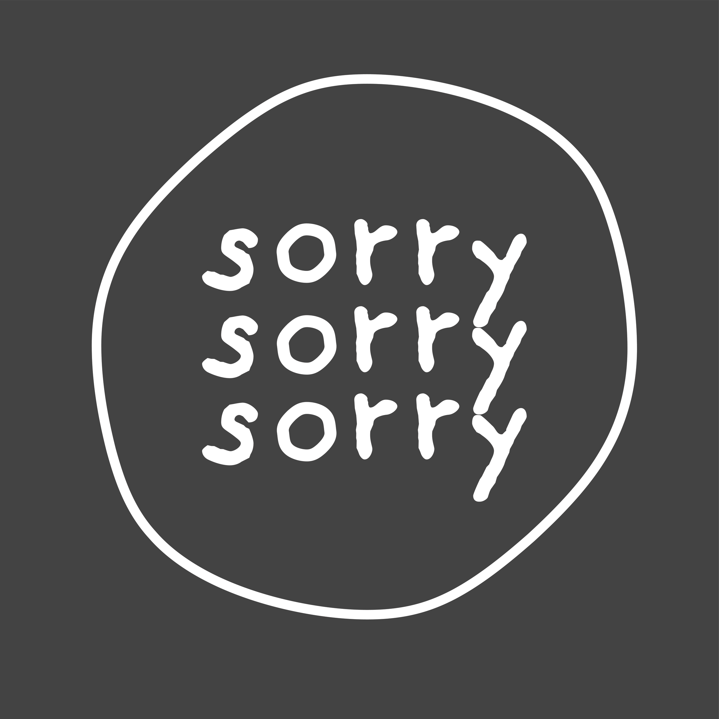
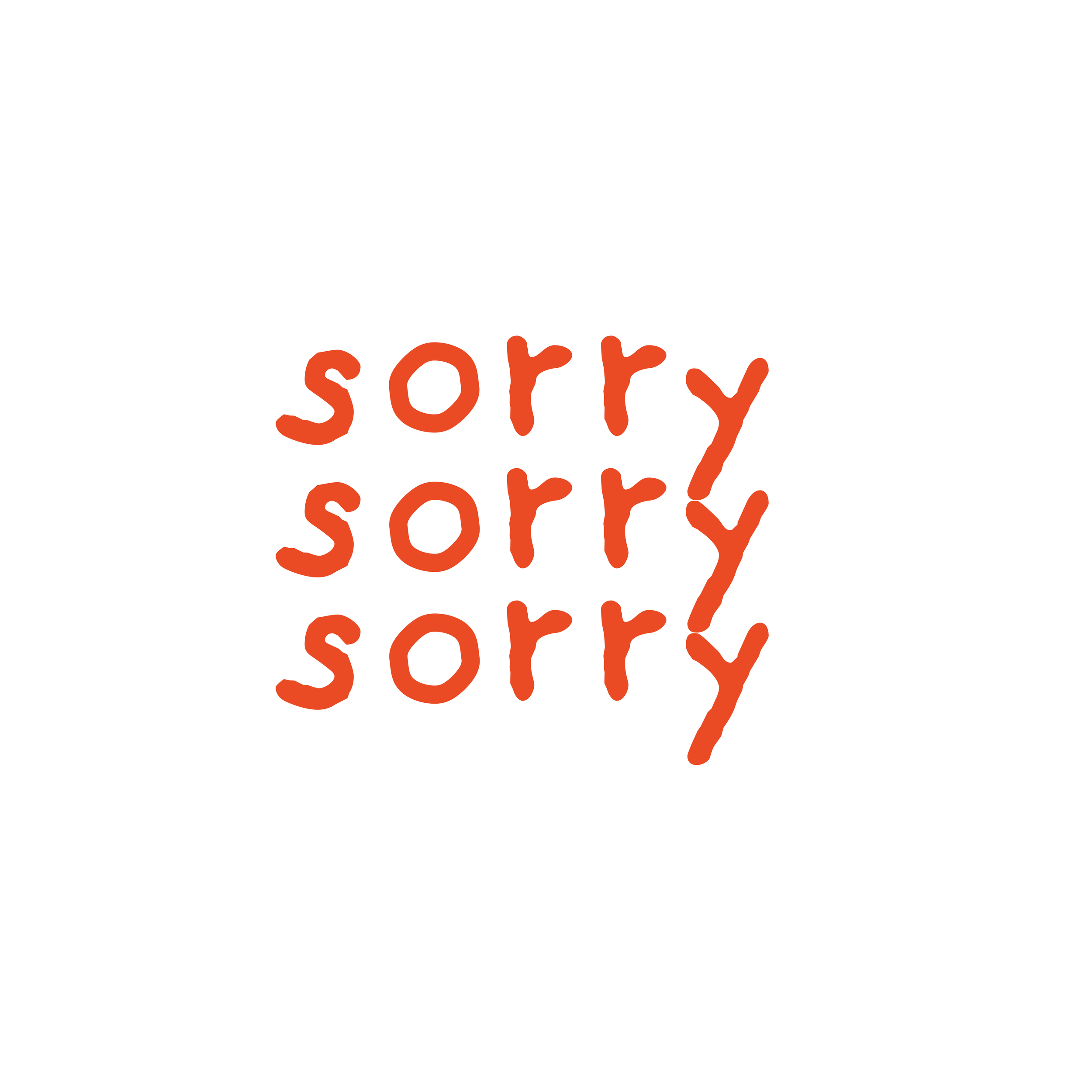
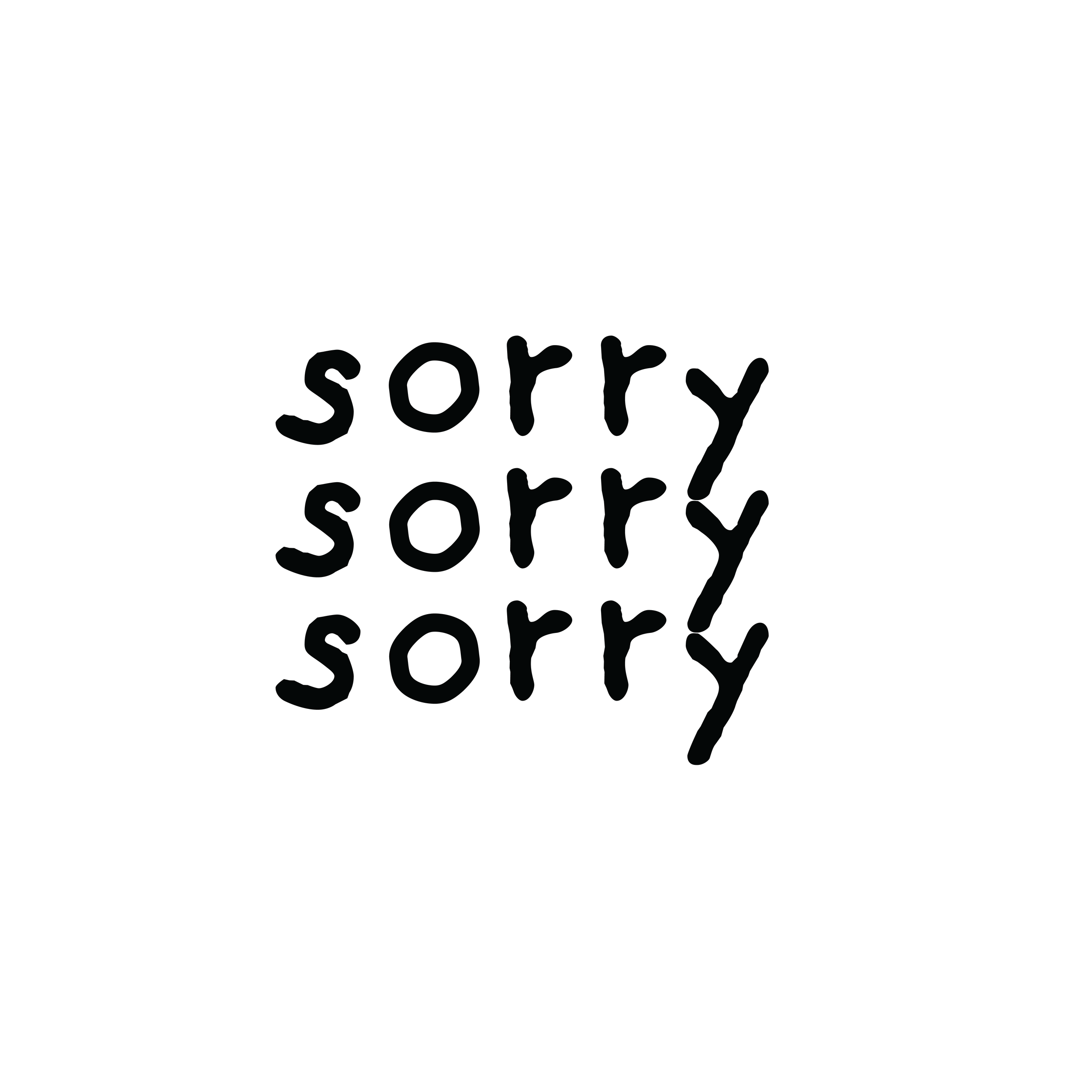
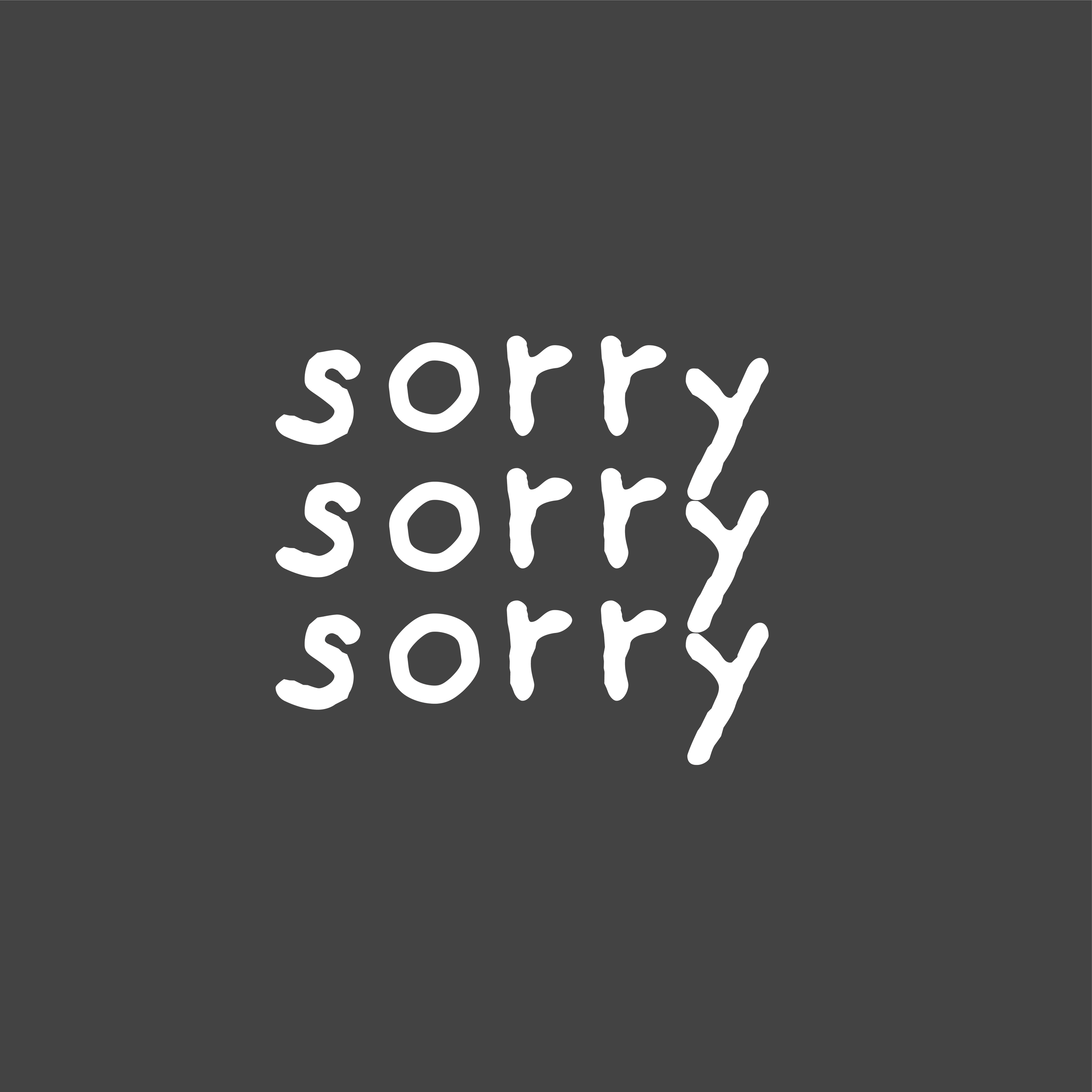
logo variations may include:
The removal of the solid pink background
The removal of the solid pink background and a black outline in place of orange
The removal of the solid pink background and a white outline in place of orange (the grey square distinguishes the white logo from the website background and should not be used in the logo design variant)
The secondary logo in black and white (the grey square distinguishes the white logo from the website background and should not be used in the logo design variant)
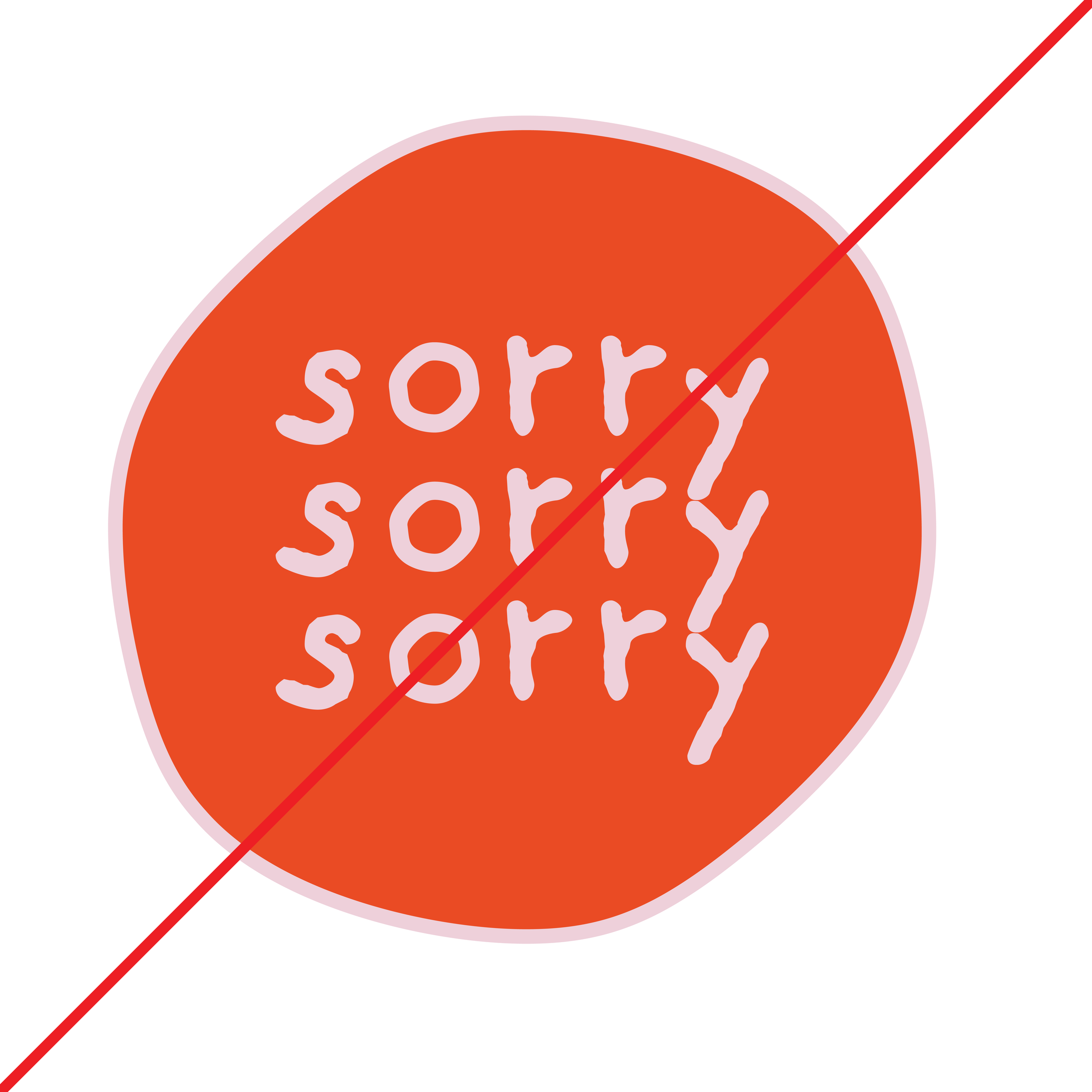
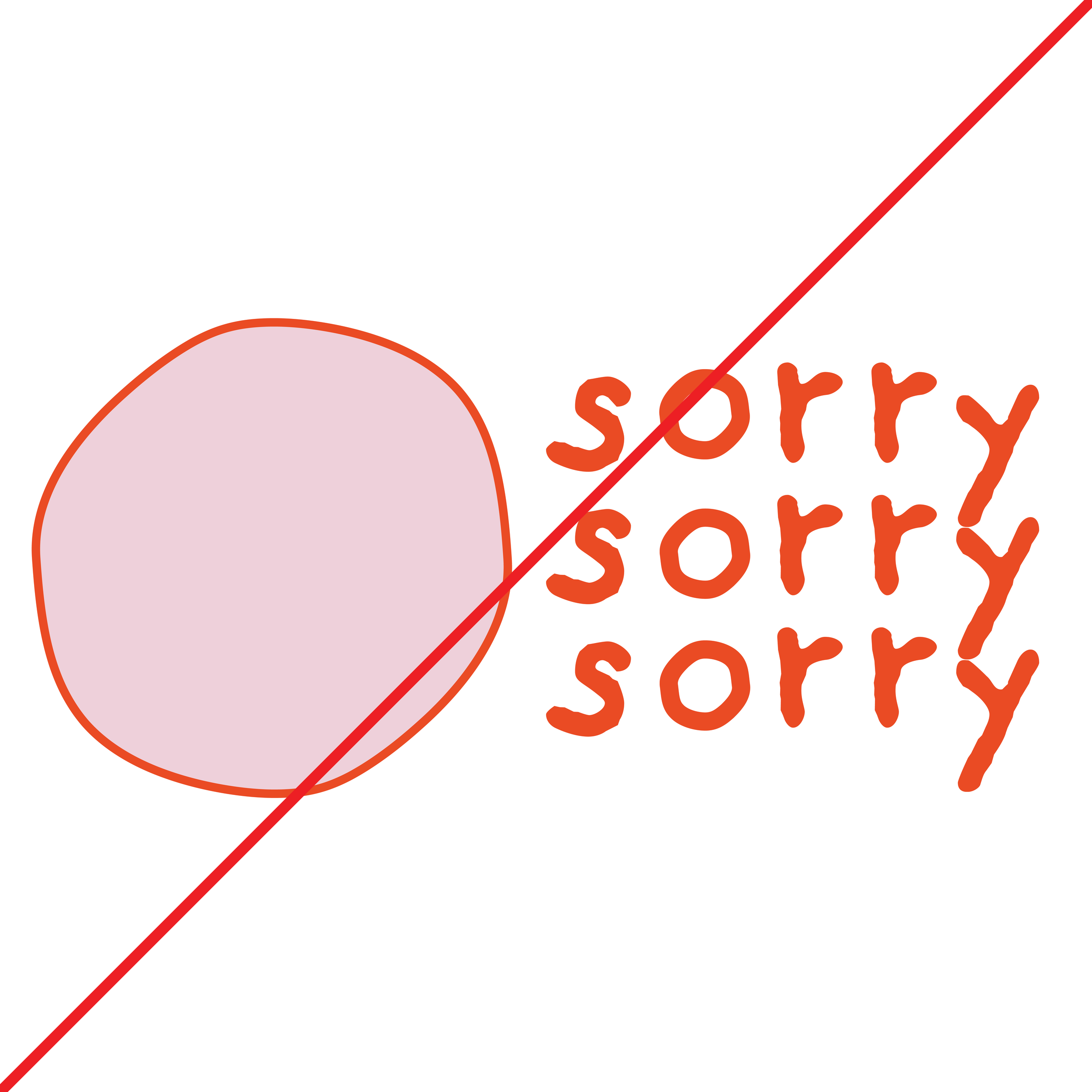
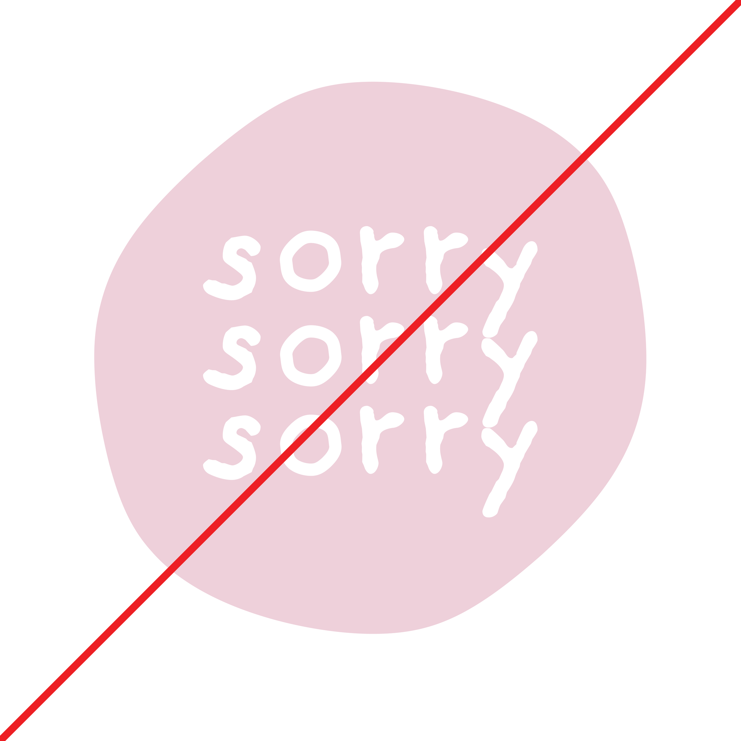
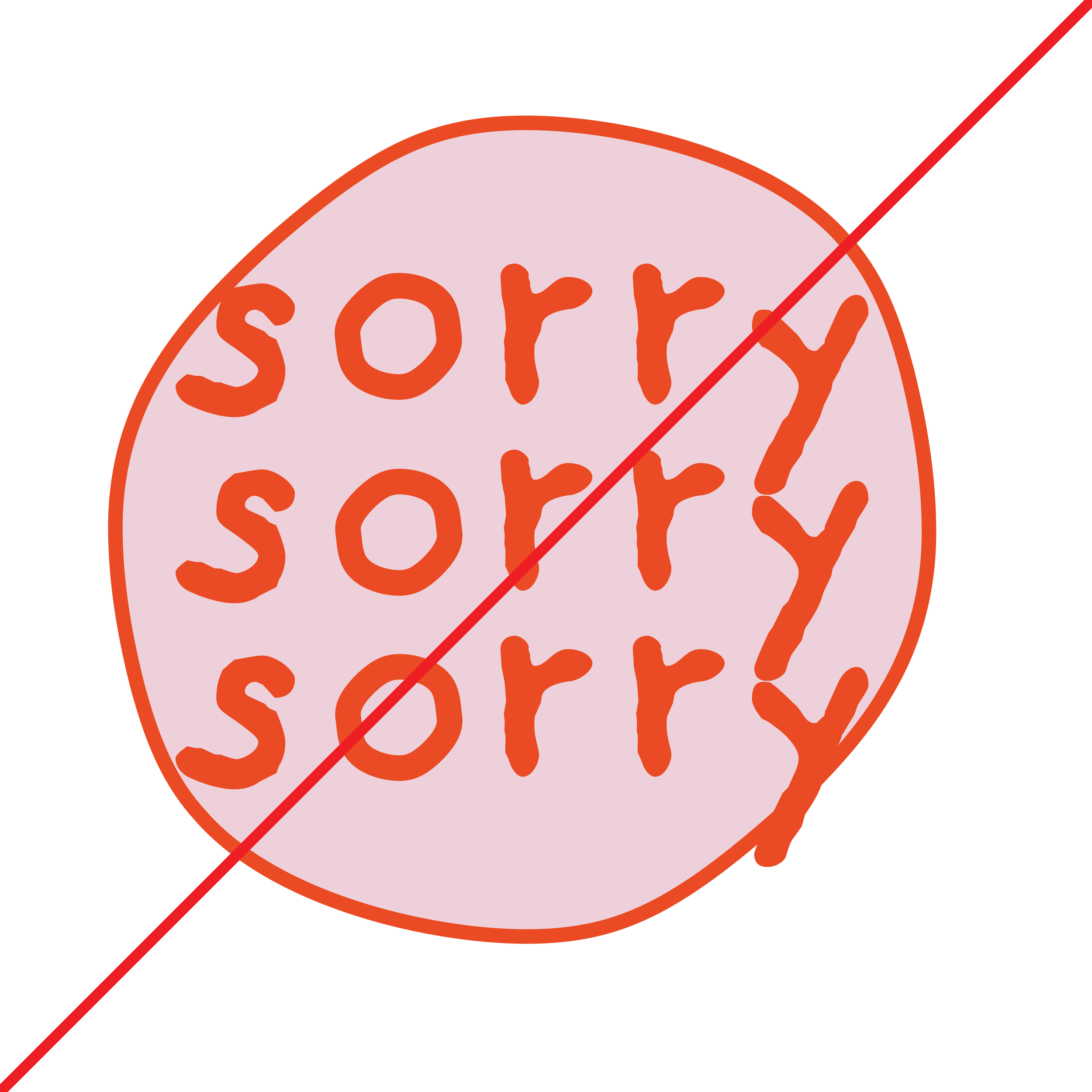
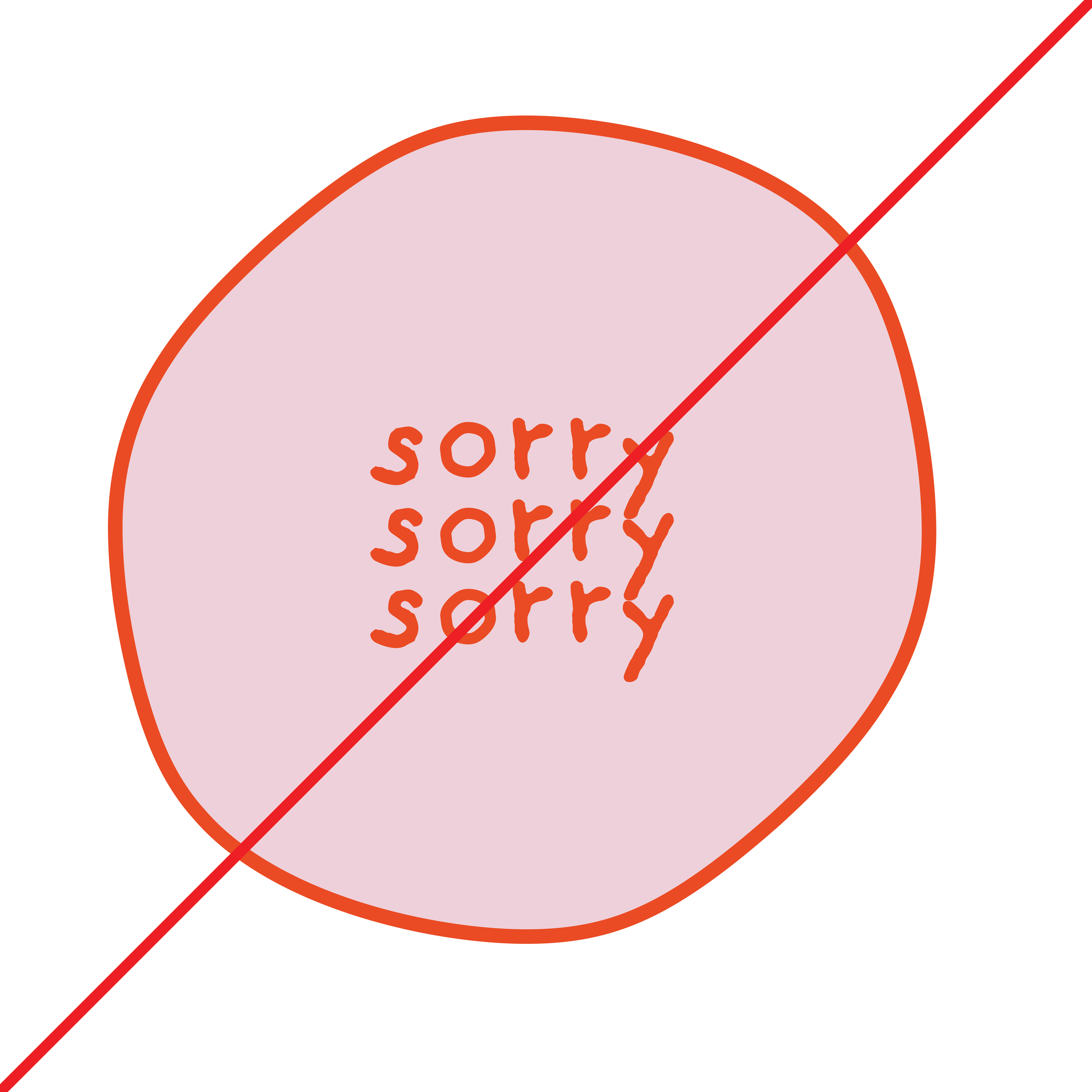
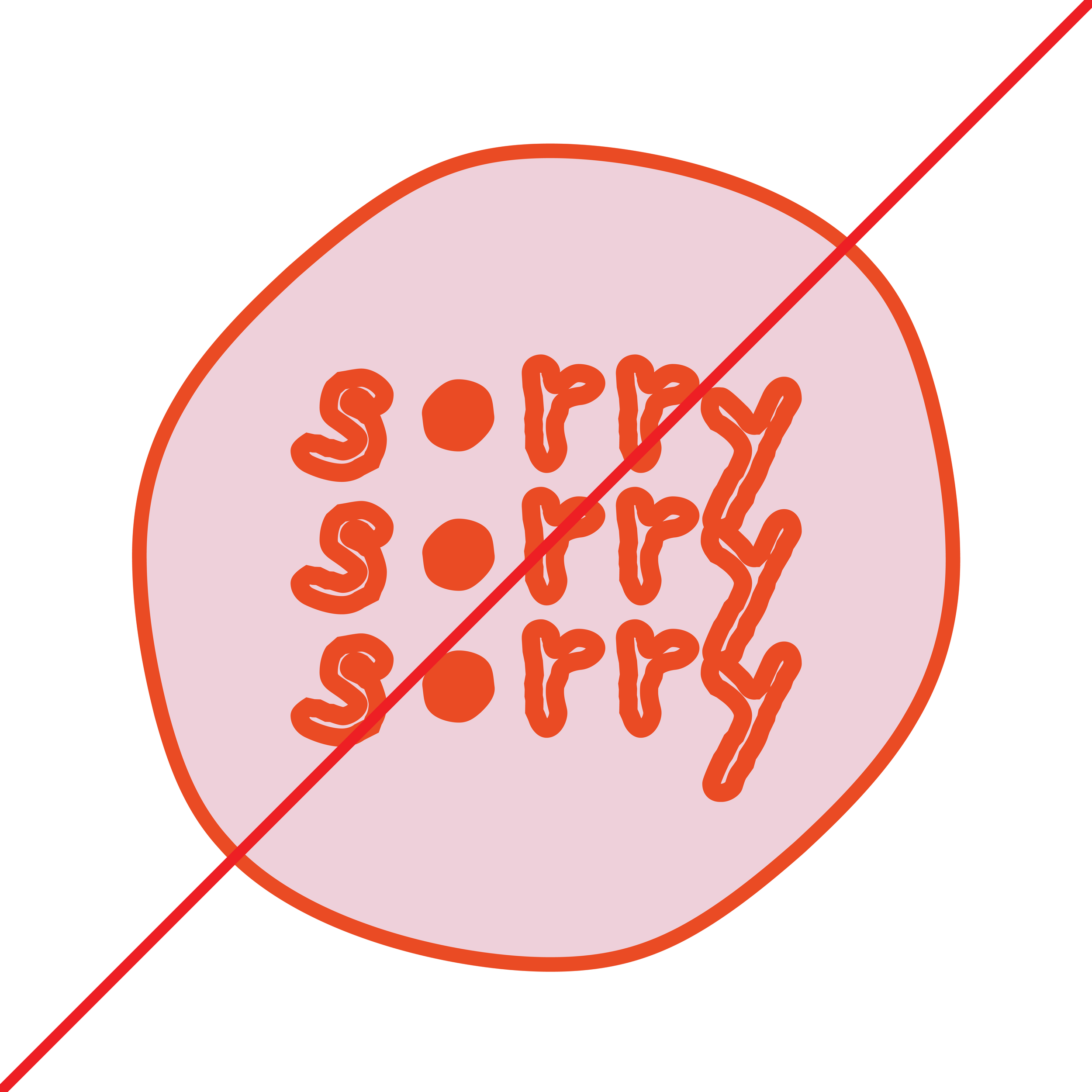
The logo should not:
Have the colors inverted
Have the wordmark separated from the logo shape
Have any colors substituted
Have any components re-sized
Have any outlines or solid colors inverted
Have any line weights re-sized
Incorrect logo use
Color palette
CYMK:
These are the colors used in printed materials.
RGB:
This is used on-screen and for web design.
HEX Code:
This color code is used on-screen and for web design.
CYMK:
5 20 6 0
RGB:
236 207 216
HEX:
#eccfd8
CYMK:
2 86 100 0
RGB:
233 76 36
HEX:
#e94c24
The deliberate contrast between the serious theme and the semi-childish color palette serves as a visual paradox, making the brand memorable and distinctive. This contrast communicates a nuanced message, indicating that while the subject matter is weighty, the brand embraces a youthful and open-minded approach to engage its audience.
The fusion of soft pink and warm orange with the theme of autonomy becomes a symbolic representation of empowerment. It communicates that strength and independence can thrive within the spectrum of traditionally feminine colors, offering a fresh and inclusive perspective on what it means to be unapologetic.
Logo Clearspace and Margins
The logo’s clearspace defines the distance between the logo and any graphic element it may be sitting next to in a composition. Use the cap height from the wordmark as a reference for the appropriate clearspace. Cap height = X
The logo’s margins are the space between the logo and the edge of the composition. When placing the logo in a composition use half the cap height (X/2) as the distance to the margin.
This is a suggested margin, but in certain instances the space can be increased.


